Beautiful branding
Colour, typography, and texture along with a smart new logo.
This is the story of how we partnered with the Klezmer Institute to create a visual identity and design language to enable them to quickly create prototypes to get funding for their vital work.
Traditional Jewish klezmer music has been kept alive even through war, pogroms, and displacement. In an amazing twist, the repertoire could be hugely expanded thanks to a treasure trove of manuscripts found in the national library of Ukraine. You can hear all about it in the podcast series, Rescued: The Lost Treasures of Klezmer.
The Klezmer Institute project is making this motherlode available online. But it’s not enough for this archive to be accessible. It also needs to be beautiful.
Making a beautiful online interactive library won’t just be good for the user experience. It willwould also help unlock further funding for this important work.
While the Klezmer Institute had plenty of technical know-how, they needed help to make the product design sing.
That’s where Clearleft comes in.
The folks at the Klezmer Institute are not lacking in ambition. They have a vision of what the final product should achieve but they don’t have experience in taking iterative steps to get to that goal. They asked Clearleft to be their strategic design partner so that they could take their ideas from concept to reality. We helped them to ask the right questions about what’s feasible and realistic.
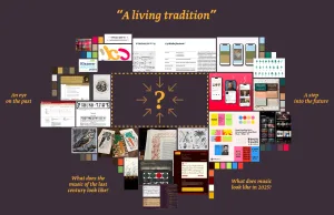
They knew they needed to start with a simple prototype. But even if it was going to be simple, it still needed to be beautiful. Even the minimal viable product should be something that users can fall in love with, and that prospective investors would see as a high-quality and worthwhile opportunity.
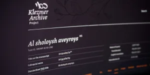
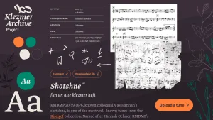
Getting the foundations right would be crucial for the future of this project. It needed to feel connected to history, without feeling dusty and buried. Instead of evoking archeology, we wanted to get across a feeling of growth and new life. Using earthy, rich metaphors of foliage and abstract tones that suggest depth, we established a visual language that feels vibrant and upbeat, like the music. It feels scholarly, but not boring. It has an eye on the past and a foot in the future.
All of this happened through constant collaboration. As well as a regular cadence of video calls to iterate on the design direction, the client had access to the Figma file at all times. This gave them the opportunity to stay in the design loop and feed back on progress while there was still time for course correction and iteration.
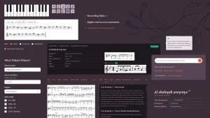
Creating a complete design system wasn’t in the scope of this piece of work. But we could still design and build in a systematic way, giving the Klezmer Institute components that can form the basis of a future design system.
We got into the browser right from the start of the product design stage. Our Figma Utopian project kickstarter file helped us hit the ground running. It’s got the majority of basic building blocks: buttons, form fields, tabs, headings. By getting the table stakes out of the way, we could spend more time focusing on the unique aspects of this project.
We used Storybook to document and store components because it’s technology-agnostic. We provided standalone chunks of HTML, CSS, and JavaScript that aren’t tied to any specific framework or library. This means that the Klezmer Archive isn’t prematurely locked into any particular tech stack. We stuck to the web platform so the client could then make whatever choice was right for them.
We made some exemplar pages that brought some of the components together, demonstrating how the components could be turned into a prototype.
The Klezmer Institute team will now be able to work much faster, with consistent outputs. They can be confident that anything they make using these styles and components will look good. They'll be able to build things we haven't even thought of yet, and everything will feel in-tune, singing from the same style sheet.
Our collaboration was one early step on the Klezmer Institute's journey to fulfil their mission to bring the rich history of klezmer music to life for everyone to enjoy. They're excited to make viable product design decisions informed by a beautifully appropriate design language. It's been our privilege to help them set the stage for this ambitious project.
We loved working with the Klezmer Institute. We felt a personal connection with them and it felt like we were all on the same mission. Music means a lot to us personally. It means everything to them.