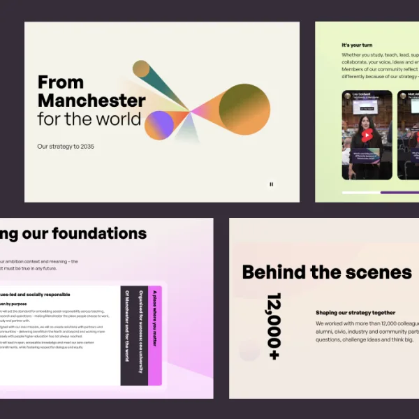
Clearleft
  • Services
  • Work
  • Thinking
  • Events
  • About
  • Contact

Primary Navigation

  • Services
  • Work
  • Thinking
  • Events
  • About
  • Contact

Interface design

Most digital products have some form of interface, whether it's a website, an app or a hardware control panel. Our team of visual designers make that interface as simple and delightful to use as possible.
A close-up view of a digital screen displaying the word "IMPERIAL" in a thin white line box at the top, followed by bold white text that reads "Scientific imagination for world-changing impact." The background features abstract circular shapes in dark blue and black, with vibrant green and pink elements at the bottom, suggesting a modern, futuristic design.
  • News

Imperial College London website redesign

Clearleft worked with Imperial College London to transform the university’s website, aligning an ambitious new strategy with a bold new brand.

Richard Rutter

Richard Rutter

A close-up view of a digital screen displaying the word "IMPERIAL" in a thin white line box at the top, followed by bold white text that reads "Scientific imagination for world-changing impact." The background features abstract circular shapes in dark blue and black, with vibrant green and pink elements at the bottom, suggesting a modern, futuristic design.
  • Case study

Imperial College London

This is the story of how we worked with Imperial to transform its website, aligning an ambitious new strategy with its bold new brand.
A web page design mockup for an article titled "Building With Fungi." The page features a vibrant illustration of a futuristic, abstract scene involving fungi-based materials. The text discusses the use of mycelium in construction and other industries. The design includes purple accents, a prominent share button, and additional informational boxes.
  • Case study

Ingenia

This is the story of how we helped the Royal Academy of Engineering redesign the website for their magazine, [Ingenia](https://www.ingenia.org.uk/).
Patterns Day
  • Viewpoint

Making the Patterns Day website

The joy of getting hands-on with HTML and CSS.

Jeremy Keith

Jeremy Keith

The graphic shows the various colours and fonts used when building the Strutt & Parker website.
  • Case study

Strutt & Parker

This is the story of how we helped one of the UK’s leading estate agents tackle their design debt.
  • Case study

The Baillie Gifford Prize for Non-Fiction

This is the story of how we designed and built a beautiful, maintainable website for discerning readers of non-fiction.
  • Tiny Lesson

Designing a Utopian layout grid: working with fluid responsive values in a static design tool.

A layout grid is a useful aid for a designer organising information in a given space. Although these grids have their roots in print design, where dimensions are fixed, fluid layout grids still have some utility in responsive design.

James Gilyead

James Gilyead

A close-up of the sidebar on a web page.
  • Case study

Malvern Panalytical

This is the story of how we laid the foundations for an ambitious digital transformation by streamlining a fragmented assortment of elements and patterns across a range of digital properties.
Two screenshots of the same purple-hued homepage on desktop and mobile.
  • Case study

Neon

This is the story of how we helped EngineeringUK take an idea for a new platform and design, build and release it in a matter of months.
  • Tiny Lesson

Tiny Lesson: How to run an ERT test

A tiny lesson on how to run a BERT test to measure how people perceive your brand.

Benjamin Parry

Benjamin Parry

  • Tiny Lesson

Tiny Lesson: Sketching, the timeless design tool

Katie shares a tiny lesson on a foolproof, simple, design tool.

Katie Wishlade

Katie Wishlade

  • Viewpoint

How to measure content

Five different ways to demonstrate the impact and effectiveness of content.

Rachel McConnell

Rachel McConnell

  • Viewpoint

What is UX writing and why does it matter

Good content is one of the most fundamental elements of good design. Here’s why everyone’s talking about UX writing

Rachel McConnell

Rachel McConnell

  • Case study

Theirworld.org

This is the story of how we worked with Theirworld to create an entirely new web presence, one that helped their rich flow of news, resources and campaigns improve children’s education and human rights across the world.
  • Viewpoint

Travelling light

Whenever I head off into the Great Outdoors I do like to be prepared, which is really just the Scouts way of saying ‘planning for the worst’.

Ben White

Ben White

  • Viewpoint

Introducing 'Voice Guidelines': for all your voice UI design needs

When you're designing for a new medium such as voice interface, it's helpful to have all the concise guidance in one place. To to solve this problem, we created voiceguidelines.clearleft.com.

Ben Sauer

  • Viewpoint

A light touch

In recent years, technological advances have enabled easier and more open connections between the digital and physical worlds. As a result we've seen a host of amazing products that have capitalised on the ability to be 'connected'.

Ben White

Ben White

People gathered together in a library.
  • Case study

Wellcome Library

Clearleft helped the global medical charity Wellcome Trust bring its extensive collection to a digital audience.
A laptop screen showing an immersive screen witht the headline that reads: The Curious Gardener.
  • Case study

Wellcome Trust Digital Stories

This is the story of how we created a storytelling platform for exploring The Wellcome Trust’s eclectic collection of medical and historical artefacts.
  • Viewpoint

It’s not a straight story. Designing with narrative for non-linear experiences.

It’s the end of the day and the orange street lights are coming on. Tucked between the skyscrapers of London’s Liverpool Street station there’s a terraced house, no more than 4 storeys high, a rich smell of wood smoke, and baked bread. Candles flickering in the window.

Ellen de Vries

Ellen de Vries

  • Viewpoint

On web typography

Typography - it’s at the heart of the web experience but with so many different options available it’s sometimes hard to know where to start when designing. Font stacking, embedding or web fonts? And what’s more important, brand or user experience? And what does this all mean for the designer who just wants to try and make type look great across as many devices as possible without losing their mind?

Ben White

Ben White

  • Viewpoint

Tate Modern’s multimedia guide – a review

Ben visits the Tate Modern and reviews their multimedia guide. He finds some usability issues, and some great opportunities in the near future.

Ben Sauer

  • Viewpoint

On Responsive Design

A final year student studying Interactive Design at Nottingham Trent University recently asked us some questions about Responsive Web Design. This is our response.

Richard Rutter

Richard Rutter

A designer is wearing a bold patterned shirt and glasses. He is sitting with a woman with long dark hair. Both are smiling and looking at a screen on a desk. Two more laptop screens can be seen in the foreground while in the background is a blurred out studio office kitchen.

You’re unique

Which is why we prefer to tailor our approach specifically for you. Let’s discuss a collaborative partnership and how we can achieve the best outcomes together.

Richard Rutter
Email Rich about your design challenge

Richard Rutter, Cofounder

  • The team
  • Join us
  • Hire us
  • Podcast
  • Privacy
  • Equal opportunities
  • Sustainability policy
  • 68 Middle Street Brighton BN1 1AL United Kingdom
  • info@clearleft.com

Copyright © 2005-Now Clearleft Ltd. All Rights Reserved.

Sign up to our newsletter

Every two weeks we send out a newsletter. It's a round-up of latest news and handpicked hyperlinks covering design, technology, and culture.