A crystal-clear proposition
The new content strategy helps to explain the unique story behind this innovative solution.
This is the story of how we partnered with Ermi to crystallise their proposition, encapsulate that into a new brand, and launch a new website …all in less than a month.
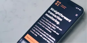
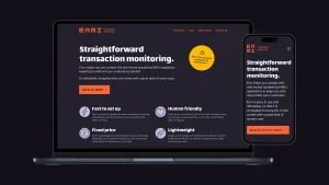
Ermi is an ambitious startup. They provide a monitoring tool to prevent financial fraud. They’re more transparent and less expensive than the competition, but they need to communicate that.
Right now they’re not big enough to have their own in-house design team so they turned to Clearleft to be their design partner … and what a partnership it turned out to be!
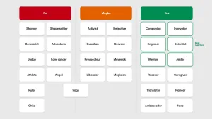
You don’t expect to find interesting personalities in the world of financial transaction monitoring. Ermi is different. They’re also the best of the best. But how do you communicate all of that in a single brand?
We worked together with the Ermi team to craft the right tone of voice that would resonate with their prospective customers. Then we co-created content together. By getting stuck in to the writing themselves, the Ermi team could really feel what was working well and what needed to be adjusted.
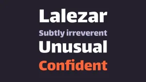
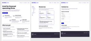
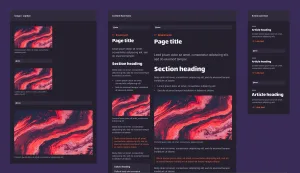
As the tone and personality of the content coalesced, the visual language needed to reflect the same vibe. With a modest timeline and no visual assets to work with, we needed to communicate using only colour, typography, and hierarchy.
Once again, constant communication was key. Together we zeroed in on a design language that captured Ermi’s unique essence. Ermi is an innovative solution brought to life via the unique relationship between Mike and Jamie. Our challenge was to hint at a good-natured irreverence without damaging the rigour and credibility of the product.
Clearleft isn’t the first agency that Ermi has worked with. They’ve been burned in the past. Some other agencies just didn’t “get” them and weren’t delivering to the high standard that Ermi expected.
It didn’t take long for Clearleft to convince Ermi that we “got” them – we recognised kindred spirits in their dedication to quality. And they “got” Clearleft. Maybe it sounds overly effusive but it really is amazing how productive you can be when you’re collaborating with like-minded partners.
You’ve got us so far so quickly – it’s a bit surreal.
Communication was key. Clearleft and Ermi forged a tight feedback loop, batting changes and comments back and forth, iterating every step of the way.
With no bureaucracy to get in the way, we produced work quickly and they made decisions quickly. If we needed to change course, we could pivot fast.
We worked with the Ermi team to figure out the best tech stack for them. They’re technically savvy, so a static site generator made more sense than a big content management system. Together we decided on Eleventy.
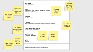
We wrote the front-end code, giving them reusable patterns that they can apply as the website expands. We didn’t have much time to produce this HTML and CSS but we made sure we didn’t skimp on quality. This website needed to be performant and accessible.
Did I mention that Jamie from Ermi is a world-renowned expert in digital accessibility? That was simultaneously intimidating and empowering.
The code we delivered got his seal of approval.
It’s enormous fun working with skilled devs. I’ve been following along as Sam at @clearleft.com builds out the new website for @ermiltd.bsky.social. It’s deeply impressive. Precise & specific, kinda like a watch maker. A virtual masterclass of code… delivered one GitHub commit at a time :)
Calling every team The Dream Team may be a cliché but Clearleft and Ermi really were a dream team. We loved being their design partner.