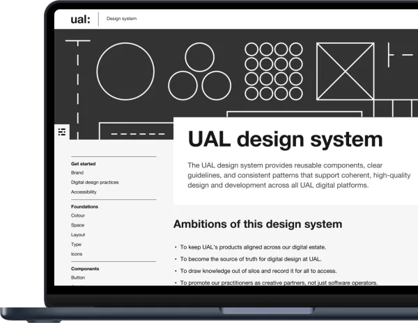
Clearleft
  • Services
  • Work
  • Thinking
  • Events
  • About
  • Contact

Primary Navigation

  • Services
  • Work
  • Thinking
  • Events
  • About
  • Contact

Product design

Two designers sitting on a table, both drawing on paper with pens.
  • Tiny Lesson

Putting the ink into design thinking

Let’s start with a thought experiment. I’m going to give you a single word and let’s see what comes to your mind.

Chris How

Chris How

  • Case study

RetailBook

This is the story of how we helped an investment bank launch a new independent platform connecting companies that are raising capital with individual retail investors.
  • Viewpoint

Applying the four principles of accessibility

Here’s how I interpret the top-level guidance in the Web Content Accessibility Guidelines.

Jeremy Keith

Jeremy Keith

  • Tiny Lesson

Three questions to ask a client before asking them for feedback

Feedback is a gift, especially when it’s from a busy client team, but are we making it as easy as possible for them to give us the right gift?

Sophie Count

Sophie Count

  • Viewpoint

Is the planet the missing member of your project team?

Five ideas to design with the environment in mind

Chris How

Chris How

  • Viewpoint

Coding prototypes

Write what you need to test a hypothesis. Then throw that code away.

Jeremy Keith

Jeremy Keith

  • Viewpoint

The intersectionality of web performance

Business, sustainability, and inclusivity.

Jeremy Keith

Jeremy Keith

  • Case study

The Baillie Gifford Prize for Non-Fiction

This is the story of how we designed and built a beautiful, maintainable website for discerning readers of non-fiction.
Low fidelity wireframe of the Sage prototype
  • Case study

Sage single view

This is the story of how we used design research to help a large organisation decide if it was worth building a unified portal for their customers.
A portion of a design file showing interface elements and illustrations.
  • Case study

Sage new concepts for product adoption

This is the story of how we helped uncover and develop original ideas to increase adoption for a market-leading SaaS product.
Two screenshots of the same purple-hued homepage on desktop and mobile.
  • Case study

Neon

This is the story of how we helped EngineeringUK take an idea for a new platform and design, build and release it in a matter of months.
  • Viewpoint

Dashboards: a design discussion

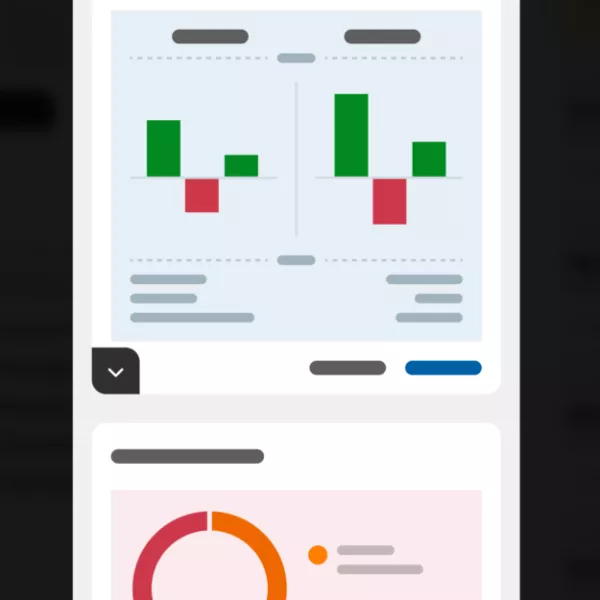
Debating the pros and cons of dashboards. What are they good for and what are the dangers?

Alex Higgs

Alex Higgs

  • News

SofaConf 2020 talks are now live

The captioned videos and Q&As from SofaConf 2020 are now live to watch and share.

Sophia Hill

Sophia Hill

  • Tiny Lesson

Tiny lesson: the question protocol

The biggest effect you can have when designing an online form is to ask the right questions, and only the right questions. In this video, Richard shows how the question protocol can help you do just that.

Richard Rutter

Richard Rutter

  • Viewpoint

The Good, The Bad and The Ugly of A/B Testing

Like many designers, I have a complicated relationship with A/B testing. In this article I’m going to explore some of the pros and cons of this approach.

Andy Budd

Utopia

Why do I like fluid responsive typography? Let me count the ways…

Jeremy Keith

Jeremy Keith

  • Viewpoint

How to move fast without breaking things

Over the last few years, I’ve worked on various product teams at different levels of velocity, but I’ve noticed that moving quickly is not the same as moving effectively.

Rachel McConnell

Rachel McConnell

Chris looking at a workshop wall
  • Case study

Training a well-known Engineering Brand

This is the story of how changing the way digital design is undertaken enabled a small but ambitious team to achieve impact at scale.
  • Tiny Lesson

Tiny Lesson: Sketching, the timeless design tool

Katie shares a tiny lesson on a foolproof, simple, design tool.

Katie Wishlade

Katie Wishlade

  • Tiny Lesson

Are you designing a product or a service?

Moving beyond products to designing end-to-end services that work front-to-back.

Katie Wishlade

Katie Wishlade

  • Viewpoint

What is UX writing and why does it matter

Good content is one of the most fundamental elements of good design. Here’s why everyone’s talking about UX writing

Rachel McConnell

Rachel McConnell

  • Viewpoint

Give your information architecture a three-point checkup

How do you know your site structure is needing attention before it becomes really broken? Here are three tell-tale signs to look for and some ways to avoid the problem in the first place.

Chris How

Chris How

  • Viewpoint

Five tips for designing successful business tools

A guide for designing successful business tools

Katie Wishlade

Katie Wishlade

  • Viewpoint

Performance is a UX problem

When front-end development is undervalued, performance suffers. And when performance suffers, users pay the price.

Andy Budd

A cartoon-style illustration filled with travel imagery.
  • Case study

Virgin Holidays Design Culture

This is the story of how Clearleft helped Virgin Holidays build its own design capability, change its approach to digital and get shortlisted for Digital Transformation at Wirehive 100 2018 Awards.
A rollercoaster ride.
  • Case study

Attraction Tickets Direct Design Sprint

This is the story of how we worked with Attraction Tickets Direct to identify and fix issues in their checkout process, in just two weeks.
  • Viewpoint

The Relationship Between Service Design and UX Design - Part 2

As Service Design becomes more digitally focused and UX projects become more and more service oriented, a shared space between the disciplines emerges. This post digs into this shared space by exploring the processes and methodologies that UX and Service Designers use in their day to day work.

Sebastien Chung

  • Viewpoint

The Relationship Between Service Design and UX Design - Part 1

With the rise of Digital Services, the boundaries between the disciplines of Service Design and UX Design–and the role of the designer–are becoming increasingly blurred.

Sebastien Chung

  • Case study

Brighton & Hove City Council Design System

This is the story of how we transformed Brighton & Hove City Council’s website from bland and difficult to use, to a vibrant and intuitive experience which helps people with their everyday lives.
  • Viewpoint

Now, Next, Future: Multi-Modal Product Management

When large organisations attempt to transform themselves, they try to do it wholesale. This often leads to significant push-back, with the more risk-averse departments slowing or derailing the process entirely. Here's how a multi-modal approach can help.

Andy Budd

  • Tiny Lesson

A simple approach to improving form design

Have you ever started filling out an form online, only to abandon the process halfway through? If so you wouldn’t be alone. This post explains a simple technique for getting more people to complete your forms and provide the information you require.

Richard Rutter

Richard Rutter

  • Viewpoint

Sound aesthetics

The aesthetics of everyday objects can be a tricky one to get right, particularly when those objects have technical specifications that impact their overall design.

Ben White

Ben White

  • Viewpoint

Smart move?

For anyone with an eye on current activity in the technology world, it will come as no surprise that the legendary Nokia 3310 'feature' phone has been relaunched by Finnish tech company HMD.

Ben White

Ben White

  • Viewpoint

On web typography

Typography - it’s at the heart of the web experience but with so many different options available it’s sometimes hard to know where to start when designing. Font stacking, embedding or web fonts? And what’s more important, brand or user experience? And what does this all mean for the designer who just wants to try and make type look great across as many devices as possible without losing their mind?

Ben White

Ben White

  • Viewpoint

In Defence of the Hamburger Menu

The hamburger menu has gone from handy UI element to social pariah. In this article Andy Budd discusses why some of the criticism may be premature and ill-informed.

Andy Budd

  • News

Clearleft on new BBC Roster

Following a three-month tender process, we are delighted to announce that we have won a place on the BBC’s coveted Digital Design roster, beating over 200 other agencies.

Andy Budd

A designer is wearing a bold patterned shirt and glasses. He is sitting with a woman with long dark hair. Both are smiling and looking at a screen on a desk. Two more laptop screens can be seen in the foreground while in the background is a blurred out studio office kitchen.

You’re unique

Which is why we prefer to tailor our approach specifically for you. Let’s discuss a collaborative partnership and how we can achieve the best outcomes together.

Richard Rutter
Email Rich about your design challenge

Richard Rutter, Cofounder

  • The team
  • Join us
  • Hire us
  • Podcast
  • Privacy
  • Equal opportunities
  • Sustainability policy
  • 68 Middle Street Brighton BN1 1AL United Kingdom
  • info@clearleft.com

Copyright © 2005-Now Clearleft Ltd. All Rights Reserved.

Sign up to our newsletter

Every two weeks we send out a newsletter. It's a round-up of latest news and handpicked hyperlinks covering design, technology, and culture.