Clarity
A clear proposition that articulates the importance of the work Resolve to Save Lives does.
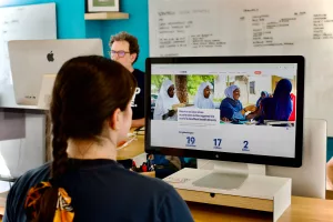
This is the story of how we worked with Resolve to Save Lives to create a cohesive, scalable content strategy for their updated website.
Resolve to Save Lives is a global health organisation that works with partners to create and scale solutions to the world’s deadliest health threats.
The organisation has always worked in a nimble and agile way, acting quickly to get things done. The team at Resolve to Save Lives wanted a more strategic approach to getting their message across on their website.
They wanted to take stock and distil the breadth of their work into messaging that they, their partners and their supporters could all get behind. That’s where Clearleft came in.
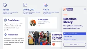
Clearleft brought a rigorous and collaborative approach to our content strategy, giving us the space to reflect on our vision, audiences, and strategic communication. They engaged a wide range of stakeholders in meaningful ways and tested various messaging and site architecture approaches directly with users. We thoroughly enjoyed the collaborative process and are now in a much stronger position to communicate the impact of our work.
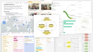
We began by doing a lot of discovery work to uncover all we could about Resolve to Save Lives – their work, audience, stories, data and information. We ran content audits, stakeholder interviews, audience interviews, and competitor analysis as well as looking at usability, accessibility, branding and messaging.
Resolve to Save Lives typically told their story by highlighting two important issues: cardiovascular health and epidemic prevention. This was working well, but that messaging didn't leave any room for including other important health threats.
We worked alongside them to answer some fundamental questions about what they do and how they do it. Their approach to saving lives is multi-faceted and involves a lot of work behind the scenes, so it was sometimes hard to communicate. One particular challenge for the team was getting the balance right between talking about their great work and making sure that partners received the right credit in the right places.
Once we had mapped out the many aims and actions of the organisation, we worked together to explain concisely what Resolve To Save Lives does:
Now that they had a clear message to communicate, we needed to organise the website’s structure around it.
The existing website had grown organically. There is a wide variety of toolkits, resources and methodologies that are important to the partners and governments that are saving lives on the ground. We needed to align the site with the updated messaging, while still ensuring that people could get what they needed from the site quickly and easily.
We talked to stakeholders, partners and donors to gather the vocabulary that made most sense for mapping the relationships between items. We settled on the primary navigation category of “How we save lives”. This allows users to quickly understand the work done by Resolve to Save Lives and its partners.
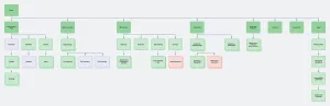
The process of reorganising content meant that we were able to spot gaps. For example, some stories needed to be restructured to be more purposeful. We made sure that everything related back directly to that primary category.
It is important for Resolve to Save Lives to apply the rigour and consistency of their new content strategy into the future.
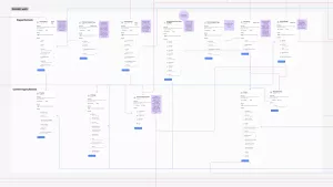
We wanted to remove as much friction as possible when creating new content. Using the building blocks of vocabulary and tone of voice, we developed content templates for future pages. Resolve to Save Lives now has a framework for the site, rather than starting from scratch with every new page.
The brand voice, storytelling and user journey workshops we ran fleshed out the plan for speaking to different audience types across all digital channels. Collaboration on a content governance plan provided Resolve to Save Lives with a structured approach to ownership, maintenance and creation of content.
Resolve to Save Lives now has a content strategy that’s clear, consistent, and scalable.
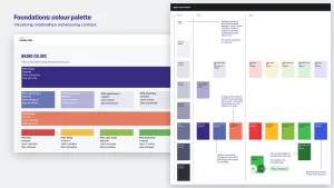
As with the content strategy, our aim with the design language was to reduce the noise and increase the signal. This process of reduction takes time and skill – it’s easier to add more than it is to remove and refine. The process of just-enough-simplification provided Resolve to Save Lives with a core set of flexible components allowing them to do more with less.
Just as we rationalised the content, we refined the page layouts to a smaller, consistent set. We also set up a digital colour palette based on the existing brand colours but with more accessible colour combinations for digital use, as well as a new blue colour to help distinguish interactive elements.
Throughout this project we were aiming for clarity and consistency. Most of all, we wanted to do everything we could to support the truly great work that they’re doing every day.
You can see the result on the new Resolve to Save Lives website.