Speed
We're quickly designing and shipping features together.
This is the story of how we're working with Anglia Ruskin University in a continuous series of small engagements as their design partner, refining and polishing the design language as we go.
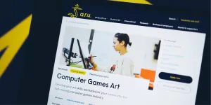
Anglia Ruskin University want their website to match the excellence of their in-person experience. But a big redesign project isn't realistic at the moment. Instead we're working together on a series of smaller engagements to incrementally improve the site experience piece by piece and realign to the brand's original direction.
With each engagement, the improvements are gaining in speed and confidence. And while we're making these iterative improvements, Anglia Ruskin University is also building and refining a design language that can be shared across the organisation.
Together, we're on a roll!
Clearleft have established themselves as a trusted design and research partner. In every project, they bring a refreshing focus, ask the tough questions, and drive quick but informed decisions. Their deep thinking and clear stakeholder communication keep us moving forward at pace.
At Clearleft, we usually work on a project for a few months. During that time, the team is focused on delivering the maximum value for the client.
But sometimes it's just not feasible for a client to hire us for one long stretch. It can be a bit of a daunting prospect for them. And while a single scoped project is perfect for something like a website redesign, it's less well suited to making smaller tactical changes.
We had already worked with Anglia Ruskin University on a research project. We were all keen to work together again, but there was no one big project that needed doing. Instead, there are lots of different parts of the current website that need improving.
We’ve got a really good cadence going. After running research to better understand user needs, together we do a short sharp design dive into one specific area of the website. Once that design phase is done, the Clearleft team disperses to other projects while the Anglia Ruskin team rolls out the changes. Then when we come back together, we bring everything learned during the previous project into the next. As long as the gap isn’t too long between engagements, this is a really effective way of working together.
Clearleft acts like a catalyst, enabling Anglia Ruskin University to move quickly, to test a hypothesis, to try making a testable prototype and to throw that prototype away if it’s not working.
What’s really nice for Anglia Ruskin University is that there’s no big risk. Each engagement has an achievable short-term goal with immediate benefit.
What’s really nice for Clearleft is that we’re building up a great working relationship without working full-time with a single client.
Best of all, every piece of work we do with Anglia Ruskin University builds on the work we’ve already done together, creating a snowball effect.
Most people consider a design system to be a library of components, whether that’s in Figma or in code. Anglia Ruskin University doesn't currently have that. But what really matters is how a systematic approach to design unlocks a team’s potential.
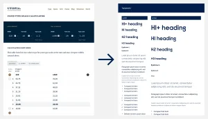
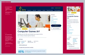
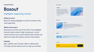
Every time we work with Anglia Ruskin University we use it as an opportunity to ruthlessly examine the components we’re working with, paring them down to their core essence so that they can be used anywhere on the website. For each one, we create a "component bio” that answers these questions:
Clarifying the components in this way has great benefits across the organisation. Everyone has a shared understanding of which components are best for which task, and crucially, everyone's using the same language to describe the same components.
That might not technically be a design system, but it brings some of the main benefits: alignment, understanding, and consistency.
For more of our thoughts on design systems, have a listen to this episode of the Clearleft podcast.
Sometimes you want to take a big swing. A complete redesign. New branding. A technical migration. In those cases, it makes sense to bring Clearleft on board to help you with your chunky project.
But sometimes you just need to finesse things. You don’t want a new brand, you just want your existing brand to work better online. You don’t want a complete redesign, you just want to tweak your existing design in places.
The cumulative effect of repeating those smaller, less risky pieces of work can be just as impactful as a complete overhaul.
Whichever approach is the right one for you, Clearleft can be your strategic design partner.