Confidence
The UAL team is empowered to get stuck in and make components for their shared design system.
This is the story of how we worked with University of the Arts London to craft a realistic, practical design system from the ground up instead of top-down.
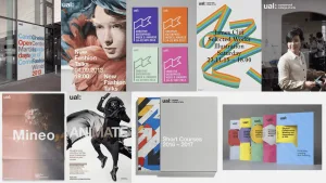
University of the Arts London is one of the best-known, high-quality design institutions in the world. But there’s a gap between the design polish of their physical campus and the design of their online presence.
UAL understands the value of having a design system to ensure consistency across their many online properties. But when they tried to create a design system in the past, they were met with resistance. Designers struggled when the system didn’t meet their specific needs; they went rogue, creating their own components to solve their own challenges.
UAL asked Clearleft to be their strategic design partner. We weren’t hired to build them a design system; we were hired to help them build their own design system …one that would be adopted this time.
Clearleft’s approach was great. It felt like they were really with us, as opposed to just working on a beautiful project to show off at the end. They asked, “how do we do the best thing to drive this forward?” Without Clearleft’s support, we would have done this a different way, and it would have taken a lot longer. It feels like there’s been a change in how we work.
We came in with a pragmatic attitude. It would be better to have an incomplete design system that reflects reality instead of a seemingly complete design system that only shows what we wish were real.
We began by interviewing people across different UAL teams about the current set-up. Whenever someone mentioned “the design system”, we’d ask “can you show us that?” People then showed us different things. Some people opened up Figma. Others showed us Storybook.
All of these silos were useful in their own way but there was no system tying them together. If you didn’t know about it, you couldn’t use it.
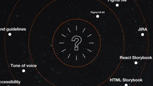
Everyone thought that their own silo was the design system, but there was no consensus across disciplines and teams.
When we played back our findings, there were some tough truths to face up to. But everyone understood and accepted that things needed to change.
Our shared mission was clear: we needed to beat the silos.
After the initial three-week discovery phase, we did three two-week sprints. Each sprint built on the lessons learned in the previous one.
We knew that there was no point in us going away and working on components in isolation. We had to work with UAL so they had ownership of the work. But everyone was busy with their day-to-day work. They agreed to devote 50% of their time to this project. We needed to show that this investment of time would be well spent.
We asked UAL to nominate a component they have the appetite to work on. We began by making an inventory of the existing implementations across platforms. Then we collaboratively refactored the component to create a single version that adapted to all of the implementations we’d identified.
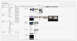
What’s the core part of this component? What are the optional elements? What are the needs of all the different online properties that might use this component? We had to make sure the component worked for all users of the design system and all use cases. We made sure everyone had a say and everyone understood why decisions had been made.
Crucially, the component is actually shipped in production to at least one of UAL’s properties. It’s not theoretical. It’s tangible.
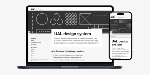
Just as important, we’d use this component as a test bed for a much-needed new documentation website to tie the design system together.
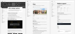
This website is for all design system users, from stakeholders and content editors through to designers and developers. It’s jargon-free, cuts to the chase and brings together how each discipline can use the component.
Everyone is looking at the same thing, in the same place. We’ve beaten the silos.
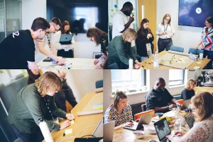
We made sure that one day of each sprint was spent in person at UAL or at our studio in Brighton. This wasn't just for Clearleft's benefit; the UAL team felt the value of being in the same room, rather than in separate rooms on separate floors. These in-person days worked as great accelerants.
UAL has working components. For the first time, they also have centralised documentation.
We’ve shown them the direction the design system should take to be successful. We got the ball rolling and now they can replicate the process.
UAL is pragmatic about building out the design system. Rather than having unrealistic expectations, they know that this will be an ongoing project. They have an extended group who are interested in the design system, and they’re welcoming everyone in to be involved, whenever they’re able. That’s more realistic than having one or two people entirely responsible for the design system.
The team is empowered. They have a common goal. The communication pathways are open.
Everyone has autonomy. They’re making the design system rather than having a design system mandated.
UAL is on the road to having its digital design match its world-beating reputation.