A bold visual identity
A new colour scheme and typography for presenting long-form content beautifully.
This is the story of how we helped the Royal Academy of Engineering redesign the website for their magazine, Ingenia.

Ingenia is a publication produced by the Royal Academy of Engineering, furthering their goal for engineering to be at the heart of a sustainable society and inclusive economy. The target audience is young people from 13 to 25 who are interested in science and technology and who might be persuaded to pursue a career in engineering.
Ingenia started life as a print publication before also moving online. The website wasn’t great though. To appreciate the great content and imagery in the articles, you’d have to download a PDF. The site wasn’t very easy to navigate either. And the Content Management System (CMS) was very hard for the team to work with.
The Royal Academy of Engineering asked Clearleft to overhaul the Ingenia website and migrate everything to a new CMS.
We began by running workshops with the Royal Academy of Engineering to understand their brand. What should we keep? What could we change? Who is the audience?
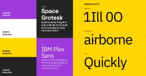
It was clear from the start that the reading experience was the top priority. Any design decisions we made needed to be in service to that. This prompted in-depth research into typography and colour for long-form reading.
The body copy needed to be legible and accessible. The headings could afford to be more stylistic, showing characteristics that emphasised the qualities of good engineering.
We had regular check-ins with the Ingenia team to show our progress and discuss the rationale behind every design decision. They gave us great actionable feedback and were very receptive to the direction we were heading in. They understood the value of good design; by giving us their trust and allowing us to be flexible, they brought out our best work.
Before long, we were translating the designs into working HTML and CSS. That meant we could make sure the design was robust enough to work in every browser and device.

The existing website had built up a taxonomy of topics over the years. But not all of those topics were useful. We needed to winnow the list down. Sometimes that meant being quite ruthless: if there wasn’t enough content to justify a topic’s existence, that topic got the chop.
This was a welcome opportunity for the Ingenia team. They hadn’t had the chance before now to step back and examine the topic list dispassionately. They appreciated the chance to question everything.
They also appreciated having our fresh eyes. We did a content review, checking for jargon. The articles needed to walk a fine line between being technically correct but also appropriate for an audience not yet immersed in the language of engineering.
As well as topics, some articles are part of a series. By combining those two categories we could offer the reader a solid recommendation on what to read next when they got to the end of an article. Whereas previously everything on the site was presented in an undifferentiated way, we could now guide readers on their journey.

The Royal Academy of Engineering had already made the decision to migrate from Kentico to Umbraco. That’s easier said than done. There was no one-click export for this. We had to figure out how to migrate over a thousand articles in time for the website’s launch. We’ll spare you the painful details, but through a lot of blood, sweat and tears, we got it done.
The Ingenia team were frustrated by the old CMS interface. They came up with all sorts of hacks and workarounds, but getting content online was still a painful process.
We listened to the team and designed a new interface based on their workflow. In the new CMS, the article is the centrepiece. There’s one tab for editing its content, and another for editing its metadata—its topics, series, issue, and so on.
We also provided training for the team, showing them how everything worked in the new CMS. We did this as early as possible because we knew there’d be so much existing content to work through.
They loved the new interface! Once they had the keys to the CMS, they started adding the content straight away. They made full use of the new tools for laying out article pages with added extras like “fun fact” boxes, videos and other embedded content.
The Ingenia team used to dread publishing a new issue. Now they look forward to it. It’s gone from being a chore to being a pleasure.
Crucially, this means the team can fully devote their time to publishing great content for young people who want to delve deeper into the rewarding world of engineering.