- Viewpoint
- Tiny Lesson
How AI helped us make sense of hundreds of components

We built a tool that checks every colour pairing in your palette and helps you fix the ones that fail.
Low contrast text is the failure WebAIM detects most often. Its 2026 analysis of the top million home pages found it on 83.9% of them (WebAIM Million 2026). That count only includes what automated tools can detect.
Behind that number are real people. Someone with low vision can't read light grey text on white or dark grey text on black. Someone with colour vision deficiency can't tell a pale button from the page behind it. An older reader, or anyone using a phone in bright sunlight, gives up on white text over a pastel background.
It's a barrier, and it's avoidable.
Brand palettes are usually chosen for mood and recognition. Contrast does get checked, but palettes and designs keep changing, and a pairing that passed once can fail later. Fixing it can mean reopening a conversation nobody wants to have. Many checkers tell you a pairing fails and leave the fix to a designer, who nudges values by hand, then checks again.
We've seen this happen on a few projects. A brand colour is chosen for decorative impact. Then the website needs it for essential, informative and interactive elements, and it fails contrast.
We proposed small value tweaks that made it pass every time. The colour looked almost the same. Technically it was different, but the brand perception held, and the site met its accessibility criteria.
So, we built This hue shall pass to make that kind of small shift quick.
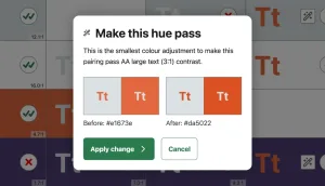
Add your palette and the tool builds a matrix of every colour combination. It shows which pairings pass or fail your chosen WCAG criteria, AA or AAA.
Not every pairing needs to pass – only the ones you plan to use together as foreground and background.
There are two ways to fix a failure:
Either way, the hue stays the same, so the colour keeps its personality. Changes show straight away, and they apply to every combination that uses that colour. Duplicate a colour to experiment without touching the original.
Colour contrast is one piece of the accessibility puzzle, and this tool handles it from start to finish. Page structure, alt text, form labels and keyboard access are other pieces, and they need their own work.
This hue shall pass started as a side project, an experiment born from our own frustration.
There are plenty of contrast checkers that show where a palette fails. We couldn't find one that also helped fix the problem there and then.
Each of us came to it from a different discipline:
James brought brand palette experience and a focus on keeping the brand's personality front of mind.
Sam brought experience of implementing palettes systematically and knew what developers need to use a pairing.
I (Alex) brought the client view: a tool that builds confidence, is shareable and makes pass and fail criteria clear.
Designers, developers and product teams all work from the same palette. Bringing our three perspectives to one idea gave us a tool that works for all of them.
Two existing tools inspired ours: Contrast Grid by Directed Edges and Contrast Finder by Tanaguru.
Curious? Add your palette to This hue shall pass and see how it holds up, then nudge any failing pairings into shape.
The tool is in beta, so it's a little rough around the edges. If you know how we could make it better, we'd like to hear from you.
Need a hand, or got a project where accessibility is stuck? Email us and tell us what you need help with.
