- Viewpoint
The last 18 months of remote testing could be summed up with a handful of quotes.
How do I share my screen?
How do I get back to the chat window?
I’m sorry I’ve not used Zoom, we use Teams.
During a test, these moments of confusion don’t appear too disruptive. But when added together, they reduce the time with a participant by five mins or more. They also break the natural flow of the test. Instructions need to be repeated, incurring further time penalties.
This is also true of testing the outputs of prototyping software.
The text is too big/small/blurry… I would fix that.
I have to scroll left/right to see the rest of the content… I would fix that.
This [interaction] doesn’t work properly… I would fix that.
This doesn’t seem to work on my phone at all… I would fix that.
The research facilitator then responds with reassurance and gives specific instructions to progress through the temporary and unwanted roadblocks.
It sometimes feels like we end up testing the limitations of our tools rather than the content and design itself.
Is there a better way we could be doing this? Sure, we can ensure we use familiar video-conferencing software with our participants. But what about the prototypes we test?
Ain’t nothing like the real thing
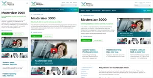
Recently I was fortunate enough to work with James, Katie and Trys on the Malvern Panalytical design system project. The design challenge and team configuration meant that our respective disciplines had context through the entire project.
The close and rapid working relationship of James and Trys meant that the design and development phases were continuously in sync. At the point of preparing for usability testing, it seemed ludicrous to move to any prototyping material other than the one we were already building in. The bedrock of the web: HTML, CSS and Javascript.
Testing this way had a number of advantages:
- Avoiding the numerous interaction shortcomings of prototyping software.
- Delivering a realistic and adaptable end-experience for our participants regardless of device and operating system.
- Showcasing the benefits of responsive design to the client.
- Demonstrating the value of the design system we were building by using it for rapid prototyping.
- Making minor content adjustments to the prototype in real-time.

These advantages resulted in a more efficient test, more constructive conversations with our participants and more valuable insights for our client.
My highlight was when a participant clicked a download link and the browser’s native dialogue box appeared. It’s that level of detail that encourages the suspension of disbelief for a participant.
Go your own way
This approach isn’t a one-size-fits-all solution by any means. We need to select the right tool for the job. In our case, selecting Figma, or a similar prototyping tool, would have incurred a lot of overhead and offered less value to the client.
One thing is clear though. Closing the gap between the design and development process has shown great value in the work we do at Clearleft. If this kind of work excites you, come and work for us as a Design Engineer.
This was originally published on my own site.
Related thinking
- Viewpoint
Remote research: Around the world in a day
- Tiny Lesson

