A tailored onboarding journey based on specific user needs
By answering some questions early on, every customer gets the right information.
This is the story of how we designed the onboarding process for a data-driven business tool.

Most businesses already have an inventory management tool. Inventory Planner does something different. You connect to your existing provider, and it provides you with recommendations and ideas based on your data.
Inventory Planner is powerful. And therein lies the problem. It can be overwhelming for new customers. We worked together with the Inventory Planner team to design a gentler, more focused onboarding experience.
The team at Inventory Planner had a hunch about where they were losing customers in the onboarding process. There’s a point where customers hook up their existing inventory management software. Syncing up the data can take time. That must be where users are getting impatient.
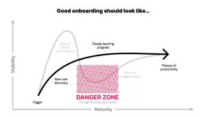
We interviewed users and the results were surprising. Waiting for the data to sync wasn’t the problem. Customers understood that it could take time. The problem was with the initial experience after signing up. It was information overload.
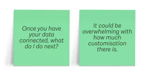
Learning to set up and use the product to its full potential requires a commitment from users. Customers were leaving the process before seeing the value.
As one of the Inventory Planner team acknowledged during our initial exploration, “We don’t peel back the layers of the onion. We chop it in half, shove it in your face... and you’re crying".
We knew that this project needed to be about communication, clarity, and content.
The Inventory Planner sales team is remarkable. If you’re on the phone with one of them, you’ll get quality customer service. Likewise, a lot of work has gone into the marketing website to extol the virtues of Inventory Planner. But once you sign up for a free trial, the human touch is less present.
It’s like being invited ‘round to someone’s house only to show up to find the door open with a note saying “Make yourself comfortable.” What you really want is to be greeted in person.
But every customer is unique. Should the onboarding process be a bespoke journey for every individual? That wouldn’t be feasible. Still, while people are all different, they share common business models. If we can identify your business model, then we can provide a better onboarding flow for you.
The onboarding process starts with a conversation. Inventory Planner asks you questions about your business, like a good host showing curiosity about newly-arrived guests. Based on the answers to those questions, you’ll be shown the information that’s most relevant to you.
What you’ve presented is amazing. You’ve hit the nail on the head in terms of our challenges. Well done to you and the team.
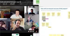
We usually put our design solutions into a functional prototype to test with real users. But in this case, we weren’t introducing any new functionality, so the prototype didn’t need to be very interactive. We pivoted from building a coded prototype to creating a visual prototype in Figma, taking the time we had allocated for development and putting it into content design instead.
We spotted an opportunity here. Inventory Planner is now under the Sage umbrella of products. This was our third project with Sage. In many ways, we were more familiar with Sage’s design language. We made sure to provide building blocks to help Inventory Planner mesh well with Sage: colour, typography, and spacing.
So while the main deliverable was the content in the prototype, we also gave them a design file with the foundations for building consistent interfaces.