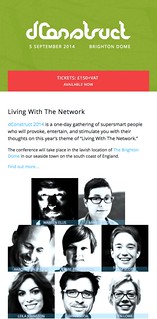
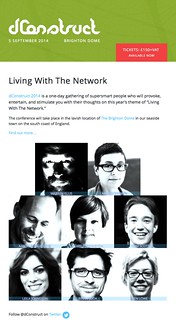
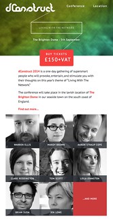
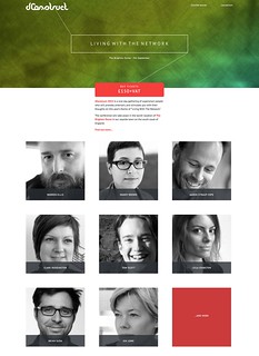
dConstruct 2014 has a new website. Huzzah!
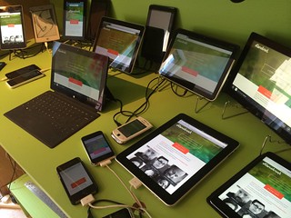
When I announced the original website two months ago, I was very, very excited about the line-up, but I was less excited about the design of the site itself. To be honest, it was a somewhat rushed affair. It did the job but it didn't have much pizzazz. I had some design direction--colour, typography, texture--courtesty of Mikey, but I didn't push it to do anything very interesting.
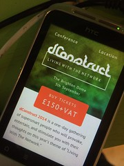
So Mikey took some time to iterate and revise, and he came up with a gorgeous new design. I think this does a much better job of capturing the spirit of dConstruct.
As well as a revised colour palette and lusher textures, there was also opportunity to do something quite playful in the masthead. Making sites for our own projects always presents a nice opportunity to try out some whacky stuff that we might not get a chance to do on client work.
In this case, the plan was to play with the theme of this year's dConstruct--Living With The Network--and use it as part of the visual design, literally networking up parts of the interface.
It was a nice chance for me to play around with canvas. But I didn't dive into code straight away. I had a think about how I could add this an enhancement to the responsive layout.
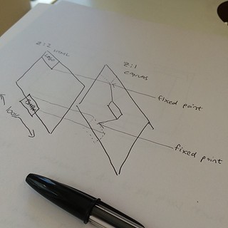
My plan was to generate a canvas element under the existing elements in the header using z-index to keep them separated while maintaining the appearance of having everything connected up.
It worked out pretty well. But I wanted to push it further. How about making it an interactive element that responds to the user?
I know, I know. It's very silly and frankly a bit wanky, but y'know, it felt like it would be nice and playful.
I had no idea how to do it though. At an internal code review here at Clearleft, I demoed what I had so far and asked for advice. The general consensus was that I should probably be using SVG rather than canvas for making interactive graphical elements. They're probably right, but I distinctly remember learning about hit detection and mouse events in canvas during Seb's excellent Creative JS workshop.
So I stuck with canvas and fiddled around with numbers until I got to something that felt lke it reacted nicely to hover events (or touch/clicks if hover isn't available ...or even if it is). requestAnimationFrame was a godsend when it came to getting smooth animations.
Have a play with it. It's hard to miss. It's not exactly a subtle easter egg.
The content of the site remains much the same. While I was disatisfied with the original visual design of the site, I'm still pretty chuffed with the copy.
One small change I made was to give the code of conduct its own page (and expand on it a bit). Previously it was included with terms and conditions but there was a good chance that it could've been overlooked there.
Anyway, I hope you like the new site. I think Mikey did a terrific job with the design and it was a lot of fun to put together ...especially the silly wanky bit. The only slight disadvantage is that the page weight comes in slightly larger than the previous design. But I'll keep optimising to see if I can shave off some bytes here and there.
Oh, and you might notice one significant change on the home page. In addition to the speakers that are currently listed, there's an addendum that reads "...and more". That's because the line-up for this year's dConstruct, awesome as it is, is not yet complete. It's going to get even better.
If you don't have your ticket to this year's dConstruct yet, what are you waiting for?
See you on September 5th.
This was originally posted on my own site.

