As designers we aim to design systematically. We codify patterns and rules to create cohesive components which then become the fabric of a design system.
But what if that system needs to support multiple brands? How do we apply that same thinking to a brand agnostic approach for flexible and robust components that still benefit from the efficiency of a single source of truth, our design system.
I had this challenge on a recent project.
The foundations
Like most projects I started in an atomic fashion, beginning with the foundations. Designing the fundamental units; type, colour, spacing and grids. This approach is great for getting the base system up and running. But the big challenge was figuring out how this will support multiple brands.
Early on I decided each brand would share the same grid and spacing values to focus more on what can make the most impact. Spacing and grids play their role in brand expression but ultimately they’re most useful in making and breaking hierarchical relationships between elements. The core of a brand's visual language comes from colour and font, not space.
Challenges of managing colour
My initial approach was to map each set of brand colours into groups of primary, secondary & tertiary values with the intention to swap them over for each brand. But with such a wide array of colour options, I couldn’t just swap them over and expect elegant and accessible components out of the box. The result would be a minefield.
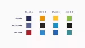
Meeting accessibility criteria - The relationships between the colours of one brand palette might meet AA WCAG 2.1 guidelines, but the same relationships might not work for another brand’s colours.
Allowing brand expression - Brands use colour in varying ways. By assigning a colour as ‘primary’ you are making an inflexible design decision at a meta level that can change brand perception. An example of this may be where a primary colour may only be used in small amounts to support a clean look and feel. But using this to determine colour at a component level removes any attempt of art directing the correct brand values.
Managing multiple systems - Sure, I could pick and choose these colours for every brand but then I’m breaking consistency from the core system. I no longer have the primary/secondary colour groups representing one source of truth. I have only created overhead by needing to maintain multiple versions for each brand that will slowly grow further apart.
Designing with tokens
I needed another solution to provide the structure and scalability of the component styles. To do this I started using tokens. What are tokens? The term was coined by Jina Anne when she was working on Salesforce’s Lightning Design System. She describes them as…
Design tokens are the visual design atoms of the design system — specifically, they are named entities that store visual design attributes. We use them in place of hard-coded values in order to maintain a scalable and consistent visual system.
This led me to look at the system in two parts.
Components - The modular, adaptable components that can flex to the needs of multiple brands and can be assembled into pages.
Brand themes - Sets of styling information specific to a brand or theme that handles colour and typography.
A brand’s set of tokens can be turned into a token sheet making up our brand theme. Then components can reference a brand theme token sheet as the source of truth.
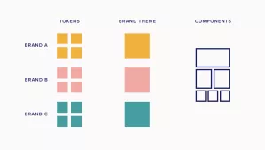
The colours used by components for every brand are governed by tokens. Tokens are a method of abstracting colours by role and the brand theme. They specify a selection of color values that serve a role—or multiple roles—in the UI.
This allows me the flexibility to change component colours for each brand independently to better reflect correct brand expression with a bit more art direction. I’m no longer tied down to the fixed three colour system in my earlier example.
A token is documented in four parts…
Brand theme - A set of unique tokens that make up a unique brand theme.
Token - The code identifier for a unique role. Tokens are universal and never change across themes. This is what keeps all our brands under one source of truth.
Role - The systematic usage of a token. Roles cannot be changed between themes. Here you specify how the token can be used beyond its name and even bake in accessibility criteria.
Value - The actual style (e.g. a hex code) assigned to a token. These can be changed for each brand theme with consideration in how they are applied.
Each white-label component would reference multiple tokens where colour properties can be changed for each brand theme while retaining the same token identifier. However remember tokens must be used consistently for its role and remain the same within each brand theme.

Design ops of tokens
This process not only helps systemise our multi brand-elements, it also sets a precedent of turning design choices into design decisions. Our neutral-600 can become $disabled, a reusable token with more descriptive intention. This is further supported with baked-in role information, accessibility criteria and usages like high/low emphasis, selections etc.
Like our component counterparts, the design decisions of tokens should be part of a governance process. This is a shared responsibility amongst a product team that doesn’t require extensive workflows but conversation between people to develop a shared understanding and space for expansion; this is especially valuable for systems in their infancy.
Once your tokens are set up, where do those design decisions live? They can live in JSON, a raw data format that can be shared not only across websites but also across platforms, building on the consistent scalable promise of a design system.
