Thanks to progressive enhancement we can use lots of awesome CSS features right now, even though not everyone uses a browser which supports them.
When using new CSS properties we can often just let CSS take care of the fallback for us. CSS is forgiving and it ignores lines of code that it doesn't understand. So browsers which don't support a particular property, just won't apply it. Let's look at an example.
CSS Shapes
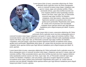
CSS shapes is simple, but beautiful, and it's really easy to add it to browsers which support it. We can make the text wrap around the circular image like this:

Here's the CSS. The important bit to note is the shape-outside property
        .shape {
  width: 20em;
  height: 20em;
  float: left;
  margin: 1em 2em 1em 0;
  border-radius: 25em;
  shape-outside: circle(50%);
}
As of last week the global browser support of shape-outside was at 65%, so it's not brilliant, but it doesn't matter. It still looks fine in browsers which don't support shape-outside. We'll just see the text wrap around in straight lines instead, which is what we are used to.

This approach enables us to use lots of new CSS, but not everything. What about more powerful CSS, which doesn't look so good in unsupporting browsers? Take blend modes for example:
Blend modes
When I last checked (this week), 72% of browsers supported background-blend-modes.
The CSS could look like this
There are multiple background images: one image and two linear gradients. Then a blend-mode has been applied. This is what you can see in 72% of browsers:

Now, here’s what you see in browsers which don’t support blend modes:

We can only see the gradient because it’s on top of the image and they aren't blending together like they should be. Without the image, the message doesn't work and we can barely read the text. We definitely can’t use this in production.
But let's not dismiss blend modes yet! We can use it in production. To help achieve this, we have a very powerful tool in CSS, which may be about to change your life. It's called @supports.
@supports
With @supports, you can write a conditional statement in your CSS to see whether or not a particular CSS property is supported by the browser; and then depending on the answer, apply a block of code. It's also known as a Feature Query.
Feature queries look a lot like media queries:
        @supports (background-blend-mode: hue) {
   /* this code will only run if
   the browser supports
   background-blend-mode: hue */
}
On the first line we write @supports, and then it’s like an if statement. Inside the brackets on the first line we say that: if background-blend-mode: hue; is supported then do everything inside the curly braces. If it’s not supported, then don’t apply the rules.
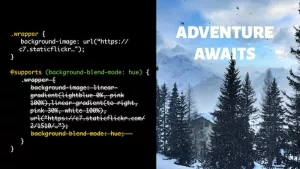
Here's how @supports enables us to use blend modes in production.
The styles applied to the wrapper class at the top are applied to every browser. So, every browser will get a background image at the very minimum. Then the wrapper styles in the @supports query are only applied to browsers which support background-blend-mode: hue; Here's the previous example in browsers which don't support blend modes. It looks so much better and we can definitely use it.

Browser support for @supports
Okay, this is great, but what’s the browser support for @supports? 77% of browsers currently support @supports. There’s no support in IE or Opera mini at the moment. What happens if @supports is not supported? Then it just won’t execute the code inside the @supports query, which is fine.
Here’s our previous example. This is what we get when @supports isn't supported. We get exactly the same results as before because it hasn't applied any of the styles inside the @supports query.

CSS shapes and @supports
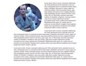
Now we can improve the CSS shapes example from earlier. Remember the text flowing around the circular image when shape-outside is supported? And when it’s not the text flows in straight lines around the circle?
Now we can tell the browser that even if it supports border-radius, only apply it when shape-outside is also supported.
        .shape{
    width: 20em;
    height: 20em;
    float: left;
    margin: 0.25em 2em 1em 0;
}
@supports (shape-outside: circle()) {
    .shape {
        shape-outside: circle(50%);
        border-radius: 25em;
    }
}
So, when the browser supports shape-outside, you'll see the left image below and when it doesn't you see the right image. This looks much better!

Multiple CSS property checks can be made via chaining 'or' and 'and'. If you want to be super careful with the CSS shapes example, you could add another condition to be 100% sure that border-radius is also supported like this:
        .shape{
    width: 20em;
    height: 20em;
    float: left;
    margin: 0.25em 2em 1em 0;
}
@supports (border-radius: 25em) and (shape-outside: circle()) {
    .shape {
        shape-outside: circle(50%);
        border-radius: 25em;
    }
}
Traditionally, we have used Modernizr to help us target CSS properties which are not supported in browsers. This has worked, but avoiding Javascript will be even better. The Modernizr script may be small, but it still has to download before any CSS can be applied. This always presents the risk that the Javascript won't get executed.
I'm so excited about @supports. It's really powerful and I think we'll be using it a lot as we implement new CSS.
This was originally posted on my site.