I've been getting a little excited about Flexbox recently, so two weeks ago I wrote an introduction to it. Since then, I've used Flexbox to solve a problem that I used to see a lot.
When I first started out in web development, I used to build a lot of portfolio sites, often including blogs that were designed using grids with items having equal heights (see example below). This was all well and good, until clients wanted to upload posts with all different lengths of text. Fair enough, too. So, a common solution to this was setting a maximum number of words or characters on each post summary, like below.
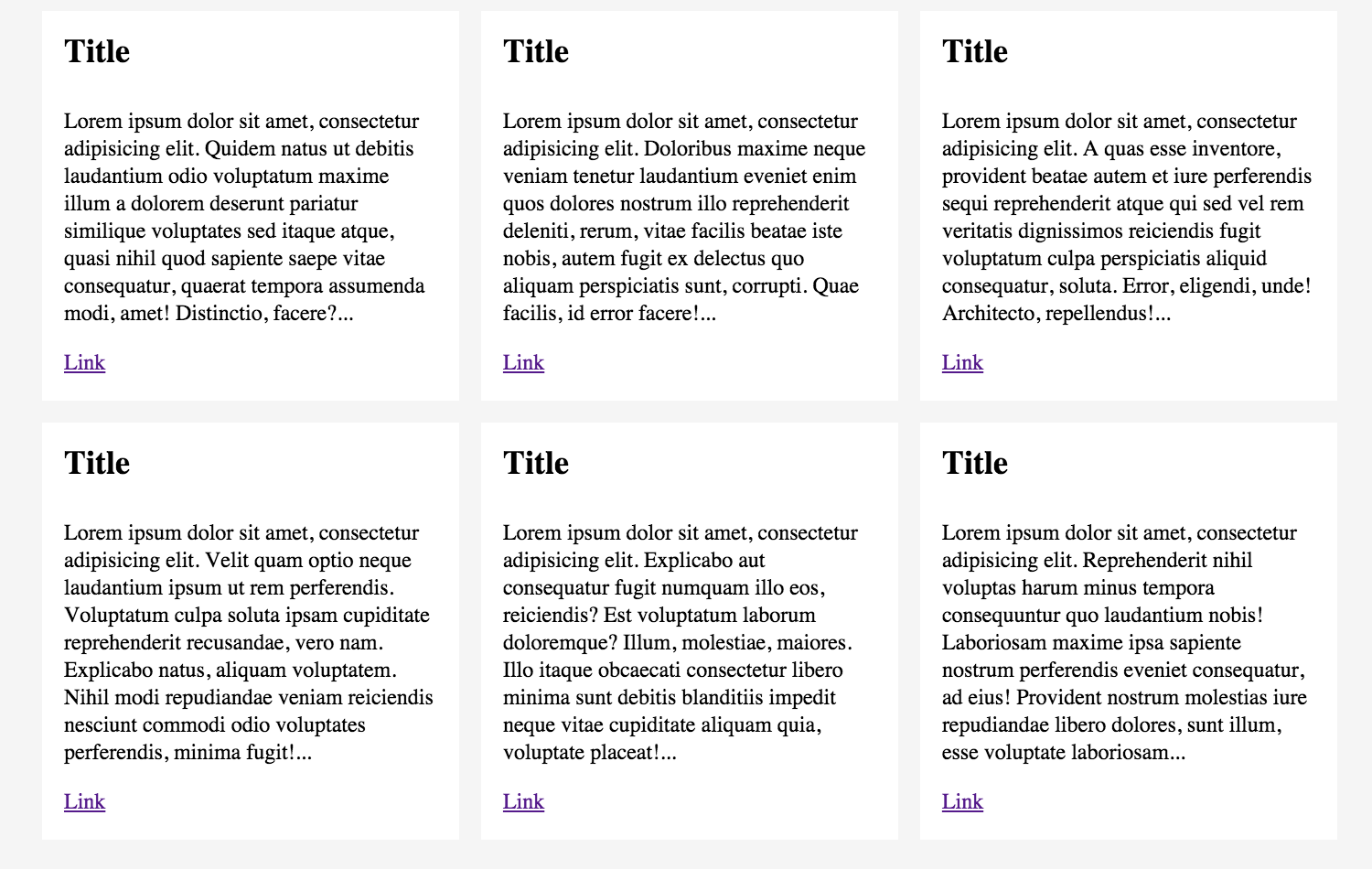
As we know, this approach is pretty restrictive. For example, if the client wanted to display an image in one post, then the heights would be unequal, so every post would need to include an image. Not ideal.
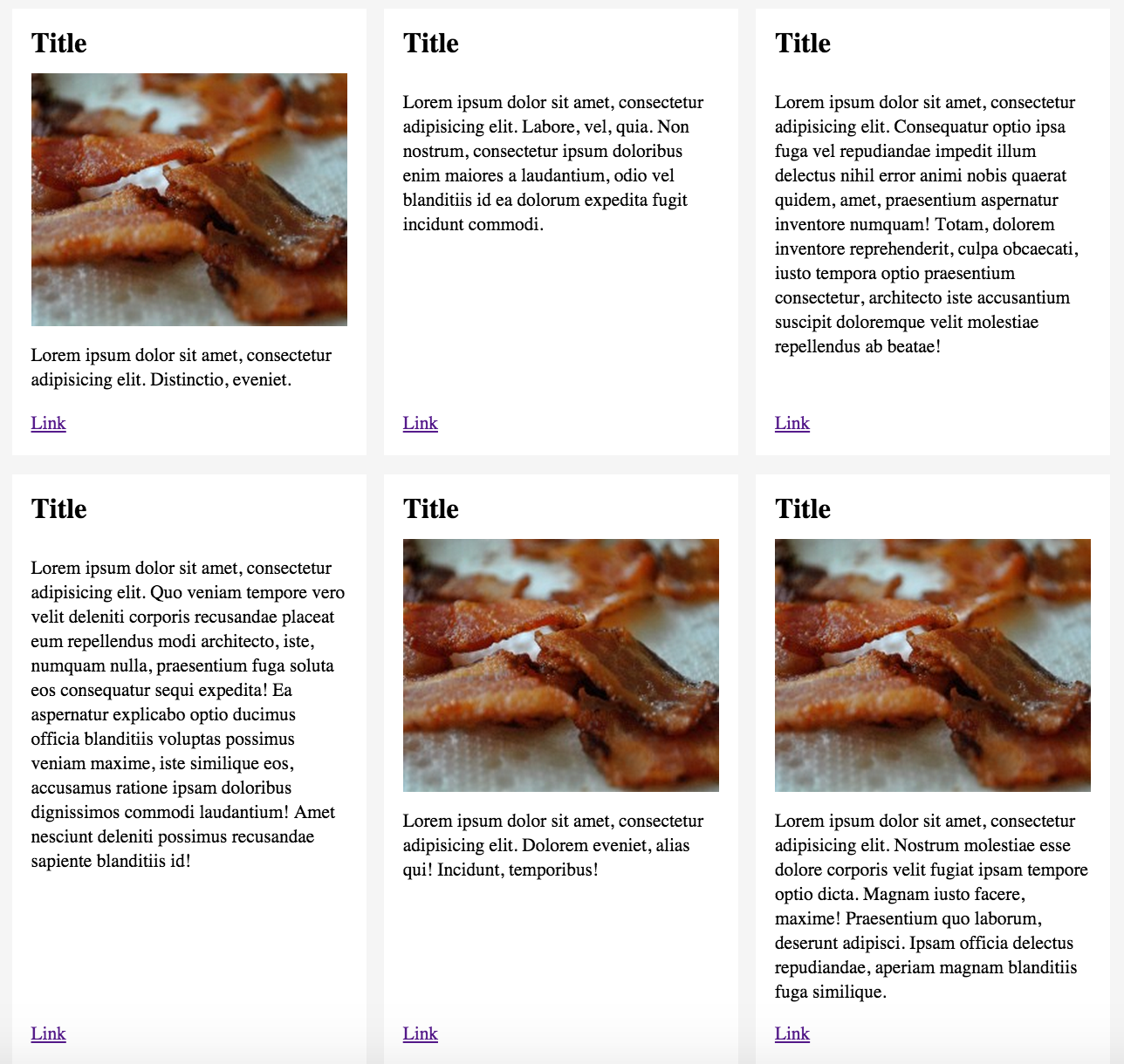
With Flexbox we don't have to choose a specific content type; we don't have to restrict the number of words; and we don't have to cut sentences off mid flow. Flex containers calculate the space available inside their containers, giving us far more flexibility with content. Thus, we can create something that looks like this:
How does it work?
Step 1: Markup
I've created a ul container with a bunch of li elements inside. Each list item contains content elements such as img, a, h2 and p.
<ul class="list">
   <li class="list-item">
     <div class="list-content">
      <h2>Title</h2>
      <img src="" alt="" />
      <p>Lorem ipsum dolor sit amet, consectetur adipisicing elit...</p>
      <a href="">Link</a>
    </div>
  </li>
  <li class="list-item">
    <div class="list-content">
      <h2>Title</h2>
      <p>Lorem ipsum dolor sit amet, consectetur adipisicing elit...</p>
      <a href="">Link</a>
    </div>
  </li>
  <li class="list-item">
    <div class="list-content">
      <h2>Title</h2>
      <p>Lorem ipsum dolor sit amet, consectetur adipisicing elit...</p>
      <a href="">Link</a>
    </div>
  </li>
  ...
</ul>
Step 2: Create a flexbox container
As mentioned in my introduction to flexbox, all that is needed to create a flexbox container is display: flex; I've added display: flex; to the containing ul element (.list), so that I can control it's child elements (.list-items). Flex-wrap means that items will move onto a new row when the horizontal space runs out – instead of squishing all of the items onto one row.
.list {
  display: flex;
  flex-wrap: wrap;
}
Step 3: Media queries
Here I've added some media queries. My layout will start with one item per row until the screen size reaches 40em. Then it will fit two items into each row until the screen size gets to 60ems, when it switches to three items per row.
@media all and (min-width: 40em) {
  .list-item {
    width: 50%;
  }
}
@media all and (min-width: 60em) {
  .list-item {
    width: 33.33%;
  }
}
Step 4: Add flex to list items
I've added display: flex; to the list-items so that each li element will stretch vertically. Flex stretches items vertically by default, so it's easy to give items equal heights. This now offers control over the child elements, allowing me to pin the links to the bottom of each post.
.list-item {
  display: flex;
  padding: 0.5em;
  width: 100%;
}
Step 5: Pin links to the bottom of list items
The final display: flex; is added to .list-content so I can style the elements inside it. As flex items are laid out in a row by default, I specified the direction to be a column.
.list-content {
   display: flex;
   flex-direction: column;
   background-color: #fff;
   padding: 1em;
   width: 100%;
}
.list-content p {
  flex: 1 0 auto;
}
Here is a property that we haven't covered yet, it's called flex. The flex property is shorthand for flex grow, flex shrink and flex basis. It defines the ability of a flex item to change it's width and height to fill the available space, which is in proportion to it's in flex grow and flex shrink values. The default value is flex: 0 1 auto;
Flex grow is the ability for an item to grow, with the value defining the proportion of space it should take up. In the same way, items can shrink using the flex shrink property. Flex basis is the initial main size of a flex item before any free space is distributed. On .list-content p, I have used flex: 1 0 auto; which means this:
- flex-grow: 1;
- flex-shrink: 0;
- flex-basis: auto;
The grow value is set to 1, which means that the p element will stretch to fit any remaining space inside .list-content. As everything else stays the same, the link gets pushed to the bottom of the div when the p element grows. Flex-basis is set to auto, so the free space is distributed based on the flex-grow value.
Here's the example on CodePen.
See the Pen Flexbox list grid by hello (@lottejackson) on CodePen.
Resources
Here's a few resources that I have found useful so far.
- W3C - CSS Flexible Box Layout module
- Can I use - Browser support
- Flexboxin5 - learn the basics of Flexbox
- A complete guide to Flexbox - Chris Coyier
- Soved by Flexbox - Philip Walton
This was originally posted on my site.