- Client
- Royal Borough of Kensington and Chelsea
- Sector
- Government
- Duration
- 9 months
- What we did
- Design research
- User experience design
- Interface design
- Responsive design

The Full Story
The Royal Borough of Kensington and Chelsea (RBKC) wanted to ‘push their information architecture forward with a design that was more device agnostic’. After speaking to our clients at Brighton and Hove Council to understand their experience of how we work and collaborate, RBKC were convinced Clearleft was the right partner to help evolve the council’s online services.
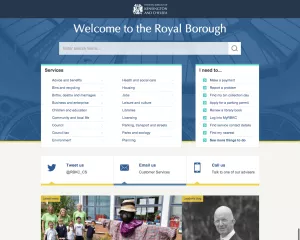
One year later, what the Council ended up with was a fundamentally changed, fully responsive website, redesigned from the inside outwards. It now puts the needs of residents first (with a vastly improved satisfaction rating), while also making life easier for the 100+ council staff who publish and edit the website.
We are continuing to work with RBKC as new services come online and additional focus is placed on the information provided by different council departments
The Method
- Planning a pilot scheme
- Extensive user research including public workshops with residents and council experts
- Innovative information architecture design
- A browser-based prototype for usability testing
- Training in responsive web design
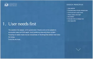
- Design principles, design manual, guides for authors, typography specification
An In-Depth Look
Planning the Pilot Scheme
Any council website is vast, covering a huge array of information and services, with a huge user base including all local residents.
Tackling the entire website in one go would have been an impossible undertaking, so instead we chose a single department - Planning - to redesign in detail. Planning is the busiest, most politically charged part of the website, so we felt this would provide the biggest test to redesign.
We worked towards testing the new Planning Department design as a public beta, and expanding the design to other departments once any kinks had been ironed out.
User Research
We wanted to find out what services and information people need from the site, and get a sense of the vocabulary and mental models they use to try and find it. We needed an understanding of what ‘plain English’ terms people were using, which at times were quite different to the more formal titles or descriptions of information created either by the UK Government or support teams in-house.
We examined server logs along with analytics keyword data to find parallels between what people searched for before finding the site and what they searched for on-site.
Using this data we ran a series of evening workshops with members of the public from the local Residents Group. The main exercise was an open card sort in which the residents organised 30 pages from the site into groups, and labelled those groups. We conducted the same exercise with the members of the Planning Department to see if there were any major differences to how they viewed the information. This provided a great deal of insight for them as they now had an inside view on what people were trying to find before potentially giving up and contacting the representatives on the phone.
The customer service team acted as an additional proxy for the general public and gave us an understanding of what people found most difficult with the site. They’re also power-users of the site and having them involved from the get-go meant we were able to find out which valuable information struggled to find.

Information Architecture
Although each department within the council has a very clear function, there are many areas of information that overlap or are reliant on one another. Under the old navigation, these relationships were unclear or entirely absent, meaning people often found themselves in loops or dead ends without finding the information they needed.
We completely reorganised the website and replaced the navigation scheme with a form of hub-and-spoke architecture. Now content is loosely joined rather than rigidly hierarchical, which enables users to find what they need more easily.
The site is organised by services (rather than Departments) and the introduction of Topic pages enables related content to be gathered together from different services on one page. This makes it far easier for those editing and creating content for the site to cross-reference. By extension residents find it far easier to track down the information they are after.

Prototyping Responsive Design
Prototyping was the only way we could properly test the navigational structures and demonstrate to the Planning Department how their existing content would fit. We built the prototype using HTML, CSS, JavaScript and a PHP backend which allowed us to inject real content into our pages, and test functionality such as searching for planning applications.
We applied our visual design language to the prototype, essentially creating a demo version of the pilot. Not only did this help us show the Planning Department team how it was going to work; including its responsive behaviour building mobile-first, it meant our user testing experiences gave more accurate results as we didn’t have to explain that “this isn’t real”, or “it’s all grey boxes because it is a prototype”. Setting expectations too low often means you don’t get good results as test participants take this into account too much.

Live Pilot
With a few sessions and a couple of refinements we were all happy with new direction for the site and so launched the pilot as a public beta. This gave us the opportunity to gather further user insight on how our new design worked with thousands of visitors and get more feedback both from the in-house teams and residents.
The results were impressive with satisfaction rates increasing by 50% during the pilot for visitors to the department pages. There was also not a single complaint, which is unheard of for a major redesign. Most important was that the Customer Service team were able to help people with more important problems than difficulties navigating the website.
Design Manual
We created a Design Manual for the Royal Borough of Kensington and Chelsea which details design principles, writing guides, accessibility guides, and the when and why to use a particular format or template.
The Design Manual enabled the many departments within the council being able to continue to work autonomously, reviewing, and adding their content to the new site design. It also allowed many departments to work at once which reduced the time required to bring the site to where it is today.
In the industry today, there is a lot of talk about style guides, or pattern libraries, and these can indeed be very powerful ways of providing build teams with the UI components for the site, but they only explain how you add something - not why and when.
Adoption
The Planning Department loved the new design and embraced the changes fully. As well as helping the public find the information and services they needed more easily, we’d also made the Planning Department’s job easier. It was clearer to them what information needed to be published (and what didn’t) and how to be much more focussed in what was actual published to the website.
The success of the Planning Department pilot permeated quickly throughout the council. As well as helping the public, we’d also made the departments’ jobs easier. Over the following year, other departments began restructuring their content into the new site, using the Design Manual we produced.
Finally, early in 2015, the home page received the same treatment and went live with the new look and radical rationalisation we’d designed.
This is one of the best and easiest websites I have used. You should be proud of this.
Further Reading
Lead designer Richard Rutter recently spoke to a large audience in Oxford about the RBKC redesign. You watch the whole talk here.
- 15% year-on-year increase in online transactions
- Govmetric satisfaction increased by 50%, now the top rated London authority
More work